Build Your Own App

SDK Documentation - Version 1.0.0

To be able to submit an application successfully, you must prepare a manifest file, three images to be used as icon, preview and logo, and a node application folder.

Your application’s information will be specified in an app manifest file which must be named ‘manifest. json’.

This manifest file must have four fields as shown below. These are:

  • name
  • identifier : must be unique and only consist of alpha character
  • description
  • fields: must be an array of available fields
  {
     "name": "Your App Name",
     "identifier": "yourappid",
     "description": "Your DashMon Application",
     "fields": [
     ]
  }

Field Types

You can get info from users by providing allowed field types listed below.

Each field must have at least three properties such as ‘type, label and identifier’.

type: property indicates what type of value it holds and the corresponding UI for that field.
label: property is used to display a label for the field to the user.
identifier: property determines how you will access the value from the Node.js application’s code. Identifier cannot be ‘name’ because it is reserved for the content name.

{
  "type": "fieldType",
  "label": "Field Label",
  "identifier": "fieldPropertyName"
}

checkbox: boolean

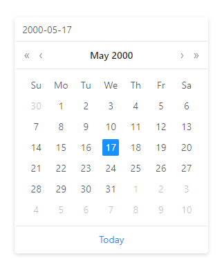
date: moment
Holds a serialized moment object. Refer to moment.js documentation for further info.

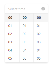
time: moment
Holds a serialized moment object. Refer to moment.js documentation for further info.

textInput: string

numberInput: number

radio: string

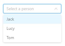
select: string
Radio and select fields must have an array property called options.

Each option must have a label and value property. Value property determines the value of identifier on your Node.js application.

"fields": [
  {
    "type": "radio",
    "label": "myRadioField",
    "identifier": "myradiofield",
    "options": [
      {
        "label": "First Option",
        "value": "first"
      },
      {
        "label": "Second Option",
        "value": "second"
      }
    ]
  }
]

switch: boolean
 

slider: number
Slider field might have additional ‘min, max and step’ field to indicate more strict information.

"fields": [
  {
    "type": "slider",
    "label": "mySliderField",
    "identifier": "mysliderfield",
    "min": 10,
    "max": 50,
    "step": 5
  }
]

Images

There are three images you should prepare to submit your app.

Icon
icon.png will be used to list your app on the right panel of contents page.

Dimension: 30px*30px

Preview
preview.png will be used to list content of your app in the contents page.

Dimension: 225px*135px

Logo
logo.png will be used to list your app in the apps page.

Dimension: 150px*140px

Node Application

DashMon Player is a Node.js application. A custom application is also a regular Node.js application, which is executed by the DashMon Player as a child process and communicated through IPC(Inter Process Communication) messages.

A custom application has lifecycle methods to be able to respond to the DashMon Player when asked, or push new information to the DashMon Player when needed.

There are two templates ready for you to make your own application. One uses client side React rendering, and requires a webpack build step. Other one uses Pug template engine on server side to serve an html file.

Before going into more detail, let’s take a look at the folder structure briefly.

Folder Structure

Pug Template

app
  |—index.js
  |—mockData.js
  |—public
  |          |—–images
  |                         |—–dashmonLogo.png
  |                         |—–dashmonText.png
  |          |—–fonts
  |                         |—–Nunito-Regular.ttf
  |          |—–index.js
  |          |—–index.css
  |—views
  |          |—–index.pug

index.js
This is your Node.js app boot file. It is responsible of fetching, calculating, preparing any data you need. It also creates a local server and serves the Pug views.

mockData.js
In a production environment, DashMon Player will feed your application with data including user specific token information, orientation of display, content information you gathered from user on the dashboard and the port number which DashMon Player wants your application to use while creating it’s server.

This file allows you to develop application without deploying to DashMon Player, we included most basic requirement on this file. You are free to change this object with content data you want to get from your users and the token info if you want to use Oauth based REST API’s to fetch information.

public
This folder includes all the images, font files, css and javascript files that you might want to use on the client side. The server created by your custom application serves all content of this folder to client.

views
Contains all the pug template files for your server to render. You are able to add as many template files as you like, and serve them according to the endpoint that your client side requests.

React Template

app
|—index.js
|—mockData.js
|—src
|     |—–components
|     |—–images
|                  |—–dashmonLogo.png
|                  |—–dashmonText.png
|     |—–fonts
|                  |—–Nunito-Regular.ttf
|     |—–index.js
|     |—–index.css
|—template.html
|—webpack.client.js
|—webpack.server.js

index.js
Different from the pug template, it serves the html files you build with webpack.

src
This folder includes all the images, font files, css and javascript files that you might want to use on the client side. Preconfigured webpack, bundles all the files from this folder and outputs to dist folder. Your server will serve files from that dist folder.

template.html
Webpack uses this html file as a template to inject your bundled javascript file.

webpack.client.js;
This is the webpack configuration file for your client side assets. Refer to webpack documentation for more info. It includes minimum required configuration including css loader, file loader and es6+ transpilation.

webpack.server.js;
This is the webpack configuration file for your server side assets. Webpack bundles all your npm packages and the custom code to a single minifed file, so that the app is published to users faster and lighter.

Lifecycle

There are two types of communication available to you. Messages sent from the DashMon Player to your application and the vice-versa. A custom application lifecycle consists of IPC messages and the functions we created for you.

init - IPC Message
If a user’s playlist contains a content of your application, the DashMon Player boots up your app and sends the IPC message of type ‘init’.
process.on('message', async (data) => {
    switch (data.type){
      case 'init':
        let {content, orientation, port, user} = data;
        await init({content, orientation, port, user});
        createServer({content, orientation, port, user});
        break;

When received, boilerplate calls the method ‘Init’ to allow you to make your initializations.
After you make your initialization, createServer is called with data including port number.

init – function
Takes all the information sent from the DashMon Player as properties.

async function init({content, orientation, port, user}){
  // Initialization
}


createServer – function
Creates a local server on port given by the DashMon Player.

You are free to add more endpoints to customize the behaviour of your application.

This method must call ready() function when it is successful. You shouldn’t remove this call to ready method or your app submission will be rejected.


function createServer({content, orientation, port, user}){
  app.get('/', (req, res) => {
    res.render('index', { title: 'DashMon Application', message: 'Sample App', content })
  });
  app.get('/info', (req, res) => {
    res.send(content);
  });
  app.listen(port, () => {
    log({message: `Listening on port ${port}`});
    ready();
  });
}


ready - function
Simply notifies DashMon Player that your application is ready to be used.
function ready(){
  if(isDevMode) return;
  process.send({type: 'isReady'});
}

display - IPC Message
When your app receives the display ipc message from the DashMon Player, it must call the display method with a URL property.

case 'display':
  log({message: 'App received display'});
  display({URL: `http://localhost:${_port}`});
  break;

display - function
This method simply sends back a response to the display ipc message received from the DashMon Player.
It sends the URL of the local server to display your html file on the DashMon Player.
function display({URL}){
  if(isDevMode) return;
  log({message: 'display sent back with path: ' + URL});
  process.send({type: 'display', path: URL});
}

log - function
Allows you to send logs to the DashMon Player.
It is advised to use this at specific points to let our tech team know about what’s going wrong in case of a bug/issue.
function log({message}){
  if(isDevMode) return console.log(message);
  process.send({type: 'log', message});
}


update – function
The only difference between calling the update function and the display function is that the display should be called only when the DashMon Player requests it.

The ‘update’ function allows you to send another URL information to the DashMon Player without a request.

As long as your content is on the screen, URL sent by ‘update’ will be shown on the screen.
function update({URL}){
  if(isDevMode) return;
  process.send({type: 'update', path: URL});
}


error - function
You should call this function when an exception happens on your code so the DashMon Player can handle accordingly.
function error({message}){
  if(isDevMode) return;
  process.send({type: 'error', message});
}

Development / Production

To start developing your application, you should first install dependencies with one of the commands below.

npm install

yarn
If you don’t have access to a the DashMon Player, or want higher iteration speed, you might work on dev mode by calling one of the commands below.

npm run dev

yarn dev
When you call these commands, a localhost server is created and starts listening. You can view the html by going to the http://localhost:80 as default.

The command below is called by the DashMon Player on production.

npm start


checkbox
{
  "type": "checkbox",
  "label": "Checkbox Label",
  "identifier": "checkboxProperty"
}

date {
  "type": "date",
  "label": "Date Picker Label",
  "identifier": "dateProperty"
}

time {
  "type": "time",
  "label": "Time Picker Label",
  "identifier": "timeProperty"
}

textInput {
  "type": "textInput",
  "label": "Text Label",
  "identifier": "textProperty"
}

numberInput {
  "type": "numberInput",
  "label": "Number Input Label",
  "identifier": "numberProperty"
}

radio {
  "type": "radio",
  "label": "Radio Label",
  "identifier": "radioProperty",
  "options": [
    {
      "label": "First Option",
      "value": "firstOption"
    }
  ]
}

select {
  "type": "radip",
  "label": "Radio Label",
  "identifier": "radioProperty",
  "options": [
    {
      "label": "First Option",
      "value": "firstOption"
    }
  ]
}

switch {
  "type": "switch",
  "label": "Checkbox Label",
  "identifier": "checkboxProperty"
}

slider {
  "type": "slider",
  "label": "Slider Label",
  "identifier": "sliderProperty",
  "min": 10,
  "max": 50,
  "step": 5
}